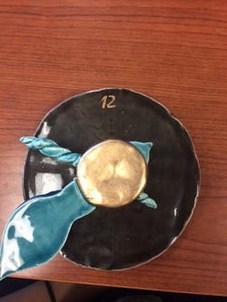
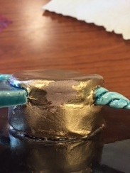
Artists Take Risks: I really tried to find a color scheme that I thought would go great on a clock and then I just picked some colors that I liked. I really like the blues those are really my favorite. After the blue I chose to go towards more of a neutral color and I was very anxious to see what it would look like with the blues. In the end it came out great! I decided to put gold in it and it made it just pop!
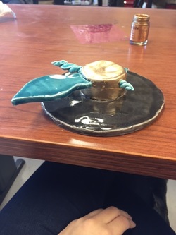
Artists Collaborate: I like to ask Julia for advice on a lot of things. On this project I asked her opinion about how it would look with the gold. Of course she always has positive feedback and told me that it would look nice. I really liked how the gold looked on her mask so that kind of inspired me to use it on the clock. It was very hard trying to find out what kind of colors to use we kind of agreed to used the blues.
 RSS Feed
